レイアウトとは
レイアウトとは、GUIの配置を決めるための仕組みです。
このレイアウトを使うことによって、Androidアプリの画面を簡単に作成することができます。
レイアウトを構成する要素
画面を構成する要素(パーツ)は大きくわけて2種類あります。
- Wedget(ウィジェット)
- Layout(レイアウト)
です。これらの要素をまとめてViewといいます。
WedgetとLayoutの違いを超わかりやすく説明します。
ざっくり言うと、Layoutの中(要素)にWedgetを配置していくイメージです。
枯山水で例えると一番親要素のLayoutを「寺院」全体として、その中の小要素のレイアウトが「庭園」、さらにその中に配置される孫要素が「砂紋」や「石」です。
それぞれ具体的にどのような種類があるか。
Wedget
- TextView
- EditText
- Button
- ImageView
- ListView
Layout
- FrameLayout
- LinearLayout
- TableLayout
- GridLayout
- RelativeLayout
- ConstraintLayout(new!)
以上が代表的なViewとなります。もちろんこれ以外にもたくさんありますが、必要な時に覚えていけば問題ありません。
どちらにも共通する要素
サイズの指定方法
.xmlでの指定は大きく分けて三つあります
- 画面いっぱいに表示する
- その要素を表示するのに必要なだけ大きさを確保する
- サイズを直接指定する
の三つです。ではそれぞれやっていきましょう。
 1
 2
 3
 4
 5
 6
 7
 8
 9
10
11
|
<?xml version="1.0" encoding="utf-8"?>
<LinearLayout
    xmlns:android="http://schemas.android.com/apk/res/android"
    android:layout_width="match_parent"
    android:layout_height="match_parent">
    <TextView
        android:layout_width="wrap_content"
        android:layout_height="wrap_content"
        android:background="@android:color/holo_blue_bright"
        android:text="テキストを表示します" />
</LinearLayout>
|
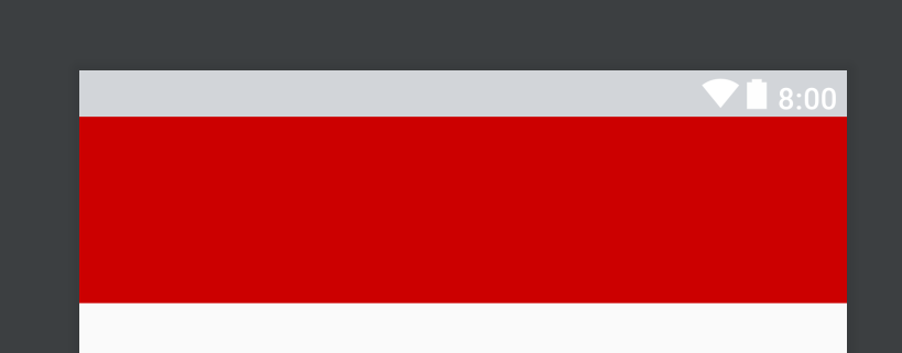
まず一旦 LinearLayoutとは何ぞやということなどは忘れてもらってこれを実際に画面に映してみると
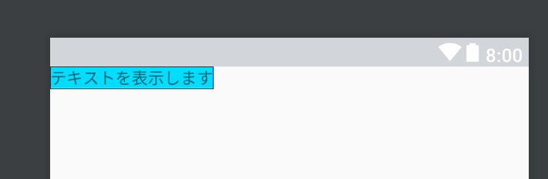
match_parent
指定したViewを画面いっぱいに表示するサイズ指定です。
今回の例ではLinearLayout(枯山水でいうところの庭園)を画面いっぱいにするために layout_width つまり横画面を match_parent に layout_height も match_parent 立て画面いっぱいにサイズ指定しています。
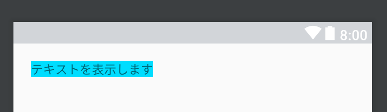
wrap_content
指定したViewを表示するのに十分なサイズを指定できます。
今回の例では TextView(テキストを表示するView 枯山水でいうところの石) のサイズを横幅も高さも wrap_content にしています。画像を見ていただければわかると思いますが水色で塗られている部分がViewのサイズです。 テキストを表示します という文を表示するためだけの高さや横幅が取られているのがわかると思います。
サイズを直接指定する
上のTextVIewを書き換えてサイズを直接してみましょう
1
2
3
4
5
|
    <TextView
        android:layout_width="100dp"
        android:layout_height="200dp"
        android:background="@android:color/holo_blue_bright"
        android:text="テキストを表示します" />
|
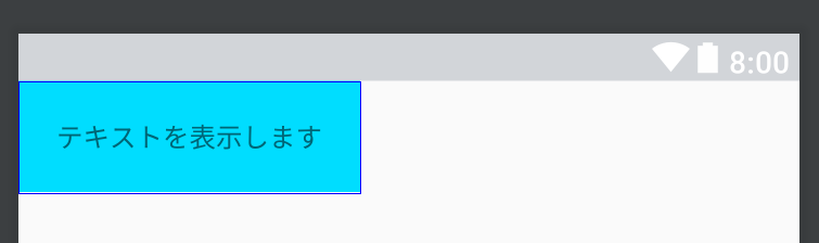
横を 100dp 縦を 200dp としているのがわかると思います。ちなみにプレビューでは
 >
>
こんな感じで縦長のサイズを指定できていると思います。
DPとは density-independent pixels の略です。解像度が違っていても同じサイズを指定できる方法です。
tips
Viewのサイズはwrapやmatchの他に数値で指定することができます。
その場合用いられるのは
の三つです。
dp
画面の密度に応じて変化する値で「比較的」相対的に用いることのできる単位です。「比較的」と含みを持たせました。基本的にはレイアウトはこれで指定するといいでしょう。
px
pxはpixelの略で絶対的な指定となります。ただし、Androidの場合は解像度がまちまちなので解像度の低い画面ではいい感じのサイズで表示されても解像度が高い画面ではめちゃくちゃ小さく表示されたりとあんまり搭乗頻度は高くないかと思われます。
sp
spは基本的にはdpと同じです。フォント向けのサイズ指定の単位なんですがユーザーがandroidOSレベルで設定しているフォントのサイズによってスケールする単位です。ぜひフォントはこれで設定してあげてください。
詳しくは非常に参考になる資料があるのでぜひご覧ください。
【Android】いまさら聞けないdp入門
余白
Viewへの余白の付け方は2通りあります。
です。
margin
marginはViewの外側に余白を作ります。
1
2
3
4
5
6
|
    <TextView
        android:layout_width="wrap_content"
        android:layout_height="wrap_content"
        android:layout_margin="20dp"
        android:background="@android:color/holo_blue_bright"
        android:text="テキストを表示します" />
|
VIewのサイズはそのままにVIewの回りに余白ができたのがわかると思います。
その余白のサイズを 20dp にするよ、という指定です。これは上下左右全てにmarginを設けていますがそれぞれ別に指定することもできます。
1
2
3
4
5
6
7
8
9
|
    <TextView
        android:layout_width="wrap_content"
        android:layout_height="wrap_content"
        android:layout_marginBottom="3dp"
        android:layout_marginEnd="10dp"
        android:layout_marginStart="10dp"
        android:layout_marginTop="3dp"
        android:background="@android:color/holo_blue_bright"
        android:text="テキストを表示します" />
|
上に余白を作るなら layout_margin_top
下に余白を作るなら layout_margin_bottom
左に余白を作るなら layout_margin_start or layout_margin_left
右に余白を作るなら layout_margin_end or layout_maring_right
padding
paddingはViewの内側に余白を作ります。
1
2
3
4
5
6
|
    <TextView
        android:layout_width="wrap_content"
        android:layout_height="wrap_content"
        android:padding="20dp"
        android:background="@android:color/holo_blue_bright"
        android:text="テキストを表示します" />
|
Viewのサイズが変わり、Viewの内側に余白ができているのがわかると思います。
これもmarginと同じく各種paddingを設けることができます。
1
2
3
4
5
6
|
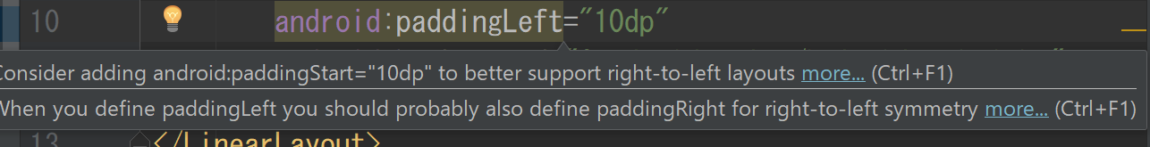
        android:paddingLeft=""
        android:paddingRight=""
        android:paddingEnd=""
        android:paddingStart=""
        android:paddingTop=""
        android:paddingBottom=""
|
tips
なぜ start と left みたいに同じことをするのに二つあるか疑問に思いませんか。
Android 4.2から RTL(右から左へ読む言語)のサポートを開始しました。
その結果Viewが逆になる可能性が発生したため Leftで指定していた時にもしRTL言語設定でアプリを起動した場合レイアウトが意図した結果にならないケースが発生するようになりました。
そこで相対的に配置するためにstartやendを使うようになったのです。
APIレベル17より下をサポートしている場合は startとleftを記述する必要がありますが、そうでない場合は基本的にはleftではなくstartを使うようにするといいですね。
Androidではバッチリ弾いてくれるので忘れることもないでしょう。
id 名前付け
Viewには名前をつけることができます。
1
2
3
4
5
|
    <ImageView
        android:id="@+id/blueImageView"
        android:layout_width="50dp"
        android:layout_height="50dp"
        android:src="@android:color/holo_blue_bright" />
|
android:id="@+id/blueImageView" の部分です。
idをViewにつけてどうするかというと今はピントこないかもしれませんが.java(.kt)からこのViewを取り出して、例えばImageViewなら画像を変更したいとなったらこの名前で呼んであげます。
Layoutとは
Viewを並べる際にはLayout属性でView属性を囲みます。
例
1
2
3
4
|
<LinearLayout>
    <TextView />
    <TextView />
</LinearLayout>
|
それぞれのレイアウトの特徴
LinearLayout
規則にしたがって順に並べていくレイアウトです。
規則は二つ存在して「縦に順に並べていく」か「横に順に並べていくか」のどちらかです。
実際に並べてみましょう。
<?xml version="1.0" encoding="utf-8"?>
<LinearLayout xmlns:android="http://schemas.android.com/apk/res/android"
    android:layout_width="match_parent"
    android:layout_height="match_parent"
    android:orientation="vertical">

    <TextView
        android:layout_width="wrap_content"
        android:layout_height="wrap_content"
        android:text="TextView1" />

    <TextView
        android:layout_width="wrap_content"
        android:layout_height="wrap_content"
        android:text="TextView2" />
</LinearLayout>
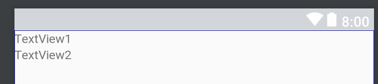
重要なのは android:orientation="vertical" こいつです。
orientationは方向 的な意味で使っています。 で、肝心な方向は先ほど言った通り2種類
- vertical(縦)
- horizontal(横)
の二つです。
未設定の場合 vertical が指定されています。
今回の例では vertical つまり 縦方向に並べてねということになっているので TextViewは縦に並びます。previewはこういう感じです
では horizontal を指定してみましょう。
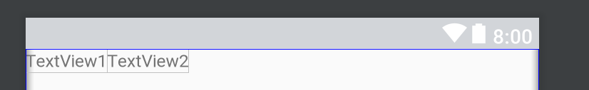
横に並びます。
【補足】Gravity
VIewはそれぞれGravityをかけることができます。
 1
 2
 3
 4
 5
 6
 7
 8
 9
10
11
12
13
14
15
16
17
|
<?xml version="1.0" encoding="utf-8"?>
<LinearLayout xmlns:android="http://schemas.android.com/apk/res/android"
    android:layout_width="match_parent"
    android:layout_height="wrap_content"
    android:orientation="vertical"
    android:gravity="center">

    <TextView
        android:layout_width="wrap_content"
        android:layout_height="wrap_content"
        android:text="TextView1" />

    <TextView
        android:layout_width="wrap_content"
        android:layout_height="wrap_content"
        android:text="TextView2" />
</LinearLayout>
|
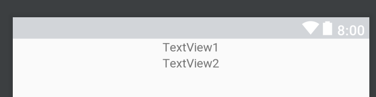
LinearLayoutでgravitiy を center にしているのがわかると思います。
このように android:gravity=“” をすると中の要素をどこにそろえるかを指定することができます。
gravityの種類
- top
- bottom
- right
- left
- center
- center_vertical
- center_horizontal
上から説明
- viewの上部に配置
- viewの下部に配置
- viewの右側に配置
- viewの左側に配置
- viewの中央に配置
- viewの上下中央に配置
- viewの左右中央に配置
また、gravityにはもう一種類存在して 自分自身にgravityをかけるものがあります。
 1
 2
 3
 4
 5
 6
 7
 8
 9
10
11
12
13
14
15
16
17
|
<?xml version="1.0" encoding="utf-8"?>
<LinearLayout xmlns:android="http://schemas.android.com/apk/res/android"
    android:layout_width="match_parent"
    android:layout_height="wrap_content"
    android:orientation="vertical">

    <TextView
        android:layout_width="wrap_content"
        android:layout_height="wrap_content"
        android:layout_gravity="center"
        android:text="TextView1" />

    <TextView
        android:layout_width="wrap_content"
        android:layout_height="wrap_content"
        android:text="TextView2" />
</LinearLayout>
|
TextView1に layout_gravitiy="center" をしているのが確認できると思いますがこのようにすると
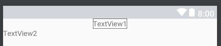
自分自身が center によります。
うまいこと使い分けてください。
FrameLayout
中のViewを重ねて表示するLayoutです。
実際にコードで確認してみましょう。
 1
 2
 3
 4
 5
 6
 7
 8
 9
10
11
12
13
14
15
|
<?xml version="1.0" encoding="utf-8"?>
<FrameLayout xmlns:android="http://schemas.android.com/apk/res/android"
    android:layout_width="match_parent"
    android:layout_height="wrap_content">

    <ImageView
        android:layout_width="100dp"
        android:layout_height="100dp"
        android:src="@android:color/holo_red_dark" />

    <ImageView
        android:layout_width="50dp"
        android:layout_height="50dp"
        android:src="@android:color/holo_blue_bright" />
</FrameLayout>
|
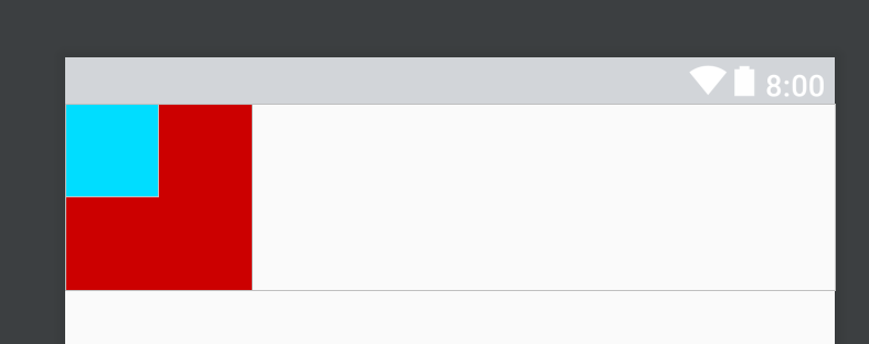
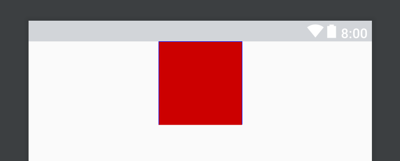
ImageViewを二つ置いていることがわかると思います。コード上、上のImageViewが赤、サイズが大きめ
またコード上、下のImageViewが青、サイズ小さめです。
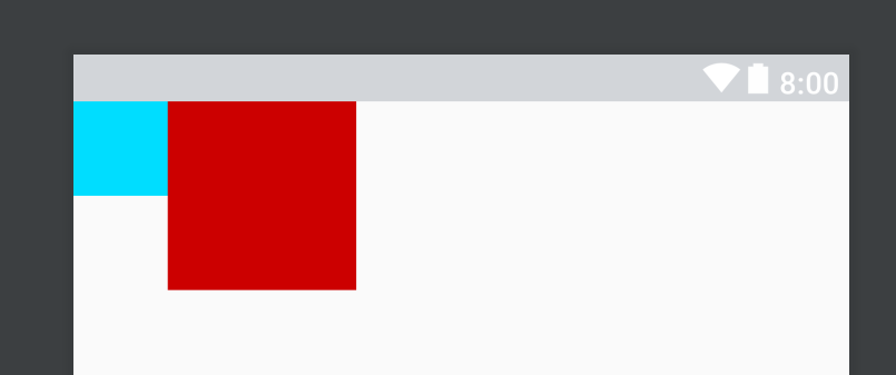
FrameLayoutではコード上で下に書かれたものが上に覆いかぶさる形で描画されるためサイズの小さい青いImageViewが隠れずに表示できています。確認してみるためにImageViewの順番を逆にしてみると…
このように真っ赤になってしまうことが確認できると思います。
ConstraintLayout
相対的な配置を行うLayoutで、もっとも最近に追加されたLayoutです。
中のViewを決めるとこに このView A は そのView B とこういう位置関係にあるよ、ということをコードで示してあげることで位置を決定するレイアウトです。実際に使ってみましょう。
 1
 2
 3
 4
 5
 6
 7
 8
 9
10
11
12
13
14
15
16
17
18
19
20
21
|
<?xml version="1.0" encoding="utf-8"?>
<android.support.constraint.ConstraintLayout xmlns:android="http://schemas.android.com/apk/res/android"
    xmlns:app="http://schemas.android.com/apk/res-auto"
    android:layout_width="match_parent"
    android:layout_height="wrap_content">

    <ImageView
        android:id="@+id/blueImageView"
        android:layout_width="50dp"
        android:layout_height="50dp"
        android:src="@android:color/holo_blue_bright"
        app:layout_constraintLeft_toLeftOf="parent" />

    <ImageView
        android:id="@+id/redImageView"
        android:layout_width="100dp"
        android:layout_height="100dp"
        android:src="@android:color/holo_red_dark"
        app:layout_constraintLeft_toRightOf="@id/blueImageView" />

</android.support.constraint.ConstraintLayout>
|
相対位置を指定するための記述は何通りか存在します。
1
2
3
4
5
6
7
8
|
        app:layout_constraintBottom_toBottomOf=""
        app:layout_constraintBottom_toTopOf=""
        app:layout_constraintLeft_toLeftOf=""
        app:layout_constraintLeft_toRightOf=""
        app:layout_constraintRight_toLeftOf=""
        app:layout_constraintRight_toRightOf=""
        app:layout_constraintTop_toBottomOf=""
        app:layout_constraintTop_toTopOf=""
|
これは何が書かれているかというと
layout_constraint 自分のどこかを _to 対象のどこかとOf = “対象のid” としています。
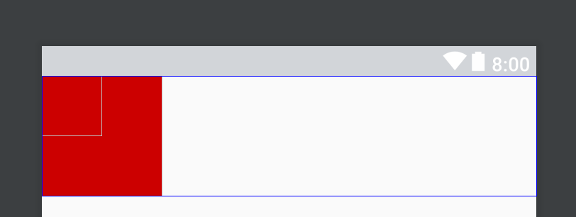
例えば app:layout_constraintBottom_toBottomOf="blueImageView" だったら
これを指定したViewの一番下をblueImageView の下に合わせて という記述になります。
サンプルで示したコードはではどのようなことをやっているかというと
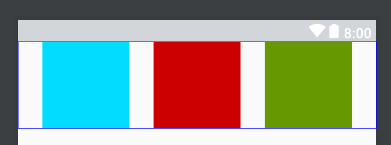
redImageView さんは app:layout_constraintLeft_toRightOf="@id/blueImageView"
つまり
redImageViewの左を blueImageView の右に合わせて
ということが書いてあります。改めてpreview画像を見ていただけるとわかるかと思いますが赤いImageViewが青のImageViewの右に来ていると思います。
で、blueImageViewは layout_constraintLeft_toLeftOf に parent なるものを指定していますが、文字通り親(つまりConstraintLayout)に合わせて、ということになります。
ですので上のxmlを日本語に訳すと
青いイメージビューの左側を親の左側に寄せて表示 赤いイメージビューを青いイメージビューの右と左に合わせて表示してください
という感じになります。
これが基本的な使い方になりますが、もう少し深く使い方を説明します。
ConstraintLayoutではmatch_parentは使わない
タイトルの通りですが match_parent は使いません。
では
こういうことをしたいときどうするの?というと
1
2
3
4
5
6
7
|
    <ImageView
        android:id="@+id/redImageView"
        android:layout_width="0dp"
        android:layout_height="100dp"
        android:src="@android:color/holo_red_dark"
        app:layout_constraintLeft_toLeftOf="parent"
        app:layout_constraintRight_toRightOf="parent" />
|
サイズの大きさを0dpにして左右をparentに合わせる形で指定することでできます。
中央に寄せる
1
2
3
4
5
6
7
|
    <ImageView
        android:id="@+id/redImageView"
        android:layout_width="100dp"
        android:layout_height="100dp"
        android:src="@android:color/holo_red_dark"
        app:layout_constraintLeft_toLeftOf="parent"
        app:layout_constraintRight_toRightOf="parent" />
|
Viewの左右をparentに指定して、といっています。
サイズの大きさを wrap_content や サイズ指定 などしていないと上のように引き延ばされてしまいますが指定されている場合はこのように中央に寄せられます。
chain
それぞれがViewでつながっている状態をまずは記述します。
 1
 2
 3
 4
 5
 6
 7
 8
 9
10
11
12
13
14
15
16
17
18
19
20
21
22
23
24
25
26
27
28
29
30
|
<?xml version="1.0" encoding="utf-8"?>
<android.support.constraint.ConstraintLayout xmlns:android="http://schemas.android.com/apk/res/android"
    xmlns:app="http://schemas.android.com/apk/res-auto"
    android:layout_width="match_parent"
    android:layout_height="wrap_content">

    <ImageView
        android:id="@+id/blueImageView"
        android:layout_width="100dp"
        android:layout_height="100dp"
        android:src="@android:color/holo_blue_bright"
        app:layout_constraintLeft_toLeftOf="parent"
        app:layout_constraintRight_toLeftOf="@id/redImageView" />

    <ImageView
        android:id="@+id/redImageView"
        android:layout_width="100dp"
        android:layout_height="100dp"
        android:src="@android:color/holo_red_dark"
        app:layout_constraintLeft_toRightOf="@id/blueImageView"
        app:layout_constraintRight_toLeftOf="@id/greenImageView" />

    <ImageView
        android:id="@+id/greenImageView"
        android:layout_width="100dp"
        android:layout_height="100dp"
        android:src="@android:color/holo_green_dark"
        app:layout_constraintLeft_toRightOf="@id/redImageView"
        app:layout_constraintRight_toRightOf="parent" />
</android.support.constraint.ConstraintLayout>
|
それぞれが相互にチェインしている状態です。
そうすると中央に寄せた時の同じことが発生して均等感覚に中央寄せになります。
でも全部の要素を真ん中に寄せたいこともあると思います。
そこでチェインを使います。
chainStyleは2種類
- layout_constraintHorizontal_chainStyle=
- layout_constraintVertical_chainStyle
です。
中の要素としては
- spread_inside(均等)
- packed(中央寄せ)
- spread (デフォルト)
中央寄せにしたい場合はpackedを指定してみます。
 1
 2
 3
 4
 5
 6
 7
 8
 9
10
11
12
13
14
15
16
17
18
19
20
21
22
23
24
25
26
27
28
29
30
31
32
|
<?xml version="1.0" encoding="utf-8"?>
<android.support.constraint.ConstraintLayout xmlns:android="http://schemas.android.com/apk/res/android"
    xmlns:app="http://schemas.android.com/apk/res-auto"
    android:layout_width="match_parent"
    android:layout_height="wrap_content">

    <ImageView
        android:id="@+id/blueImageView"
        android:layout_width="100dp"
        android:layout_height="100dp"
        app:layout_constraintHorizontal_chainStyle="spread"
        android:src="@android:color/holo_blue_bright"
        app:layout_constraintLeft_toLeftOf="parent"
        app:layout_constraintRight_toLeftOf="@id/redImageView" />

    <ImageView
        android:id="@+id/redImageView"
        android:layout_width="100dp"
        android:layout_height="100dp"
        android:src="@android:color/holo_red_dark"
        app:layout_constraintLeft_toRightOf="@id/blueImageView"
        app:layout_constraintRight_toLeftOf="@id/greenImageView" />

    <ImageView
        android:id="@+id/greenImageView"
        android:layout_width="100dp"
        android:layout_height="100dp"
        android:src="@android:color/holo_green_dark"
        app:layout_constraintLeft_toRightOf="@id/redImageView"
        app:layout_constraintRight_toRightOf="parent" />

</android.support.constraint.ConstraintLayout>
|
それぞれ変更してみて挙動を確認してみてください。